
VOCA
Designing a vocabulary app that is fun &
makes new terms stick
The project
Project brief
VOCA is a vocabulary app that makes you learn new words and phrases easy and long term.
Project duration
3 weeks
Project role
UX, Visual Design
Tools
Figma, Miro
Primary stakeholder
CareerFoundry Intro to UX course
The challenge
Create a vocabulary learning app that includes:
a way to upload new vocabulary words and definitions that allows users to input their own definitions, written or otherwise
a means of reviewing vocabulary that allows users to study efficiently and effectively
The Design Process
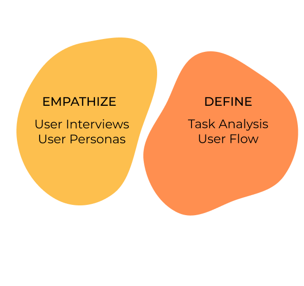
EMPATHIZE
User Research
To understand what users of vocabulary learning apps need, I conducted 4 user interviews. I aimed to learn more about their general behaviours & needs experience with other vocabulary apps resolving around these four criteria:
how & when do/did they usually use the vocabulary apps
what motivated them
what frustrated them
why did they stop using the app
This is what I learned:
-
Insight 1
Users feel that writing their own definition of a word helps them remember it long-term
-
Insight 2
Users want to engage with the language on their own terms, learn new words they stumble upon instead of solving the same predefined tests
-
Insight 3
Users enjoy an engaging, fun motivating way of learning vocabulary and like to connect with other learners
DEFINE
User Persona
Based on the insights in behaviours and needs of the possible users of the app, I created one user persona that represents the main user group.


-
Behaviours
>> Works full-time and plays as much as possible with her son after work
>> Used to play vocabulary games in the evening but stopped as the games didn’t reflect her learning progress
>> Loves Swedish crime series and immersing herself in a new culture
>> Enjoys learning together with others -
Needs & goals
>> Wants to learn Swedish to integrate better
>> As a working mom, Ana needs an easy-to-use and fun so that learning in the evenings doesn't feel like work
>> As a visual learner, she wants to see a cool and fun design so that she can enjoy learning Swedish while increasing the learning effect

User Flows
The insights gained from the creation of the user persona’s needs, frustrations, pains and goals defined which functionalities to prioritize and which flows to optimize first. I decided to prioritize two flows:
The app sends Ana a notification to remind her to train their vocabulary sets based on a spaced repetition schedule to retain them in their long-term memory.
Ana reads an article in Swedish and wants to learn the meaning of a new word and save it to her vocabulary learning set.
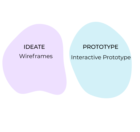
IDEATE
Wireframes
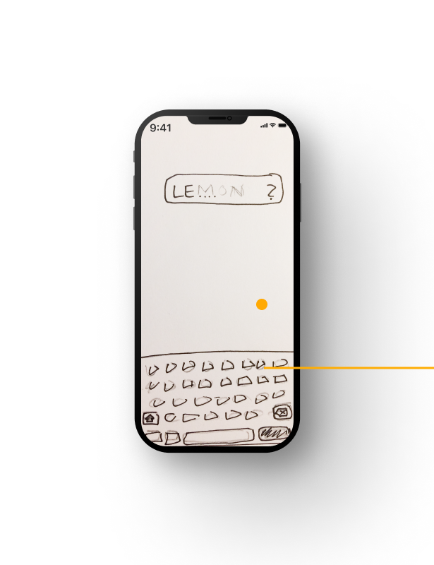
To be able to test two of the main functionalities, I started sketching and designing the required screens for the optimized user flow. The screens should be rather minimal without being monotonous and for further engagement, I added a micro-interaction in form of confetti guns for correct answers.
-
![]()
Search word in dictionary
-
![]()
See translation
-
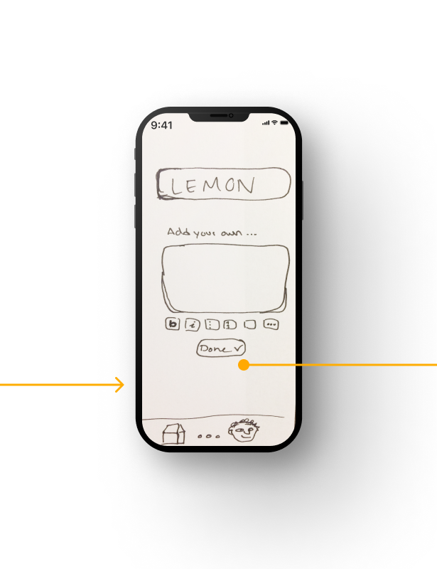
![]()
Add own translation
-
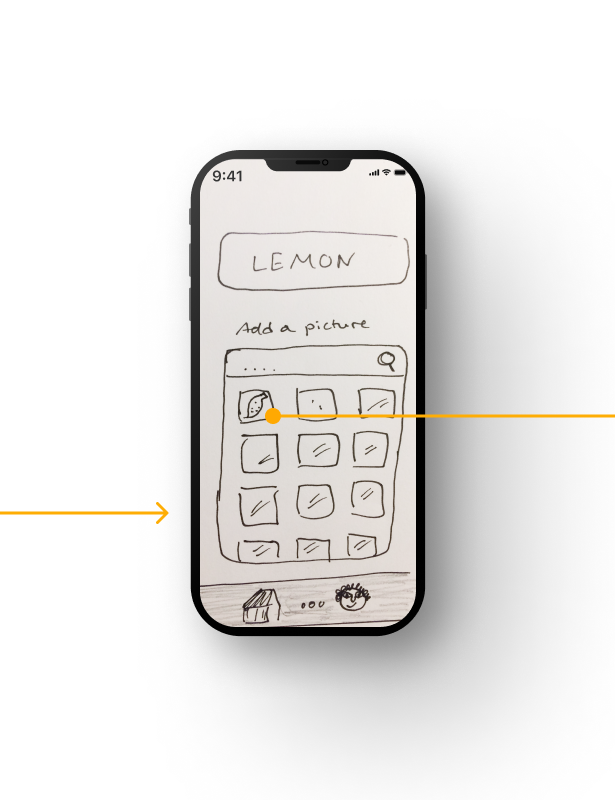
![]()
Add a picture
-
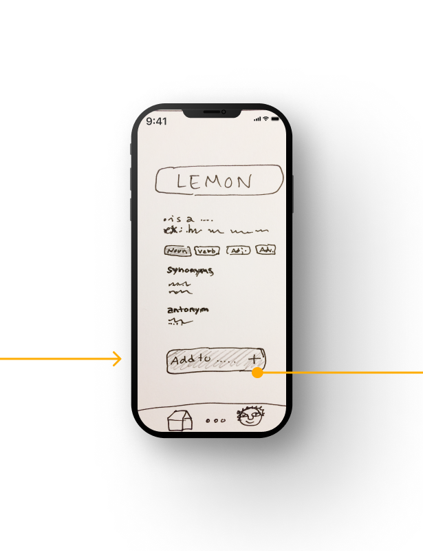
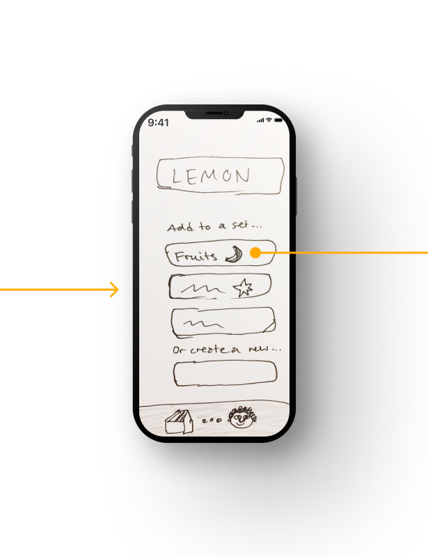
![]()
Add to card deck
-
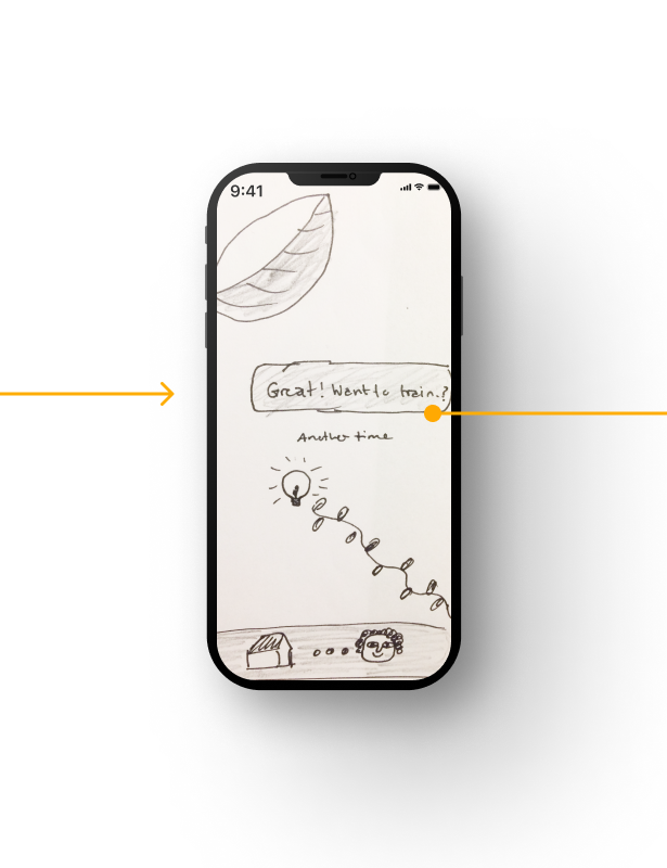
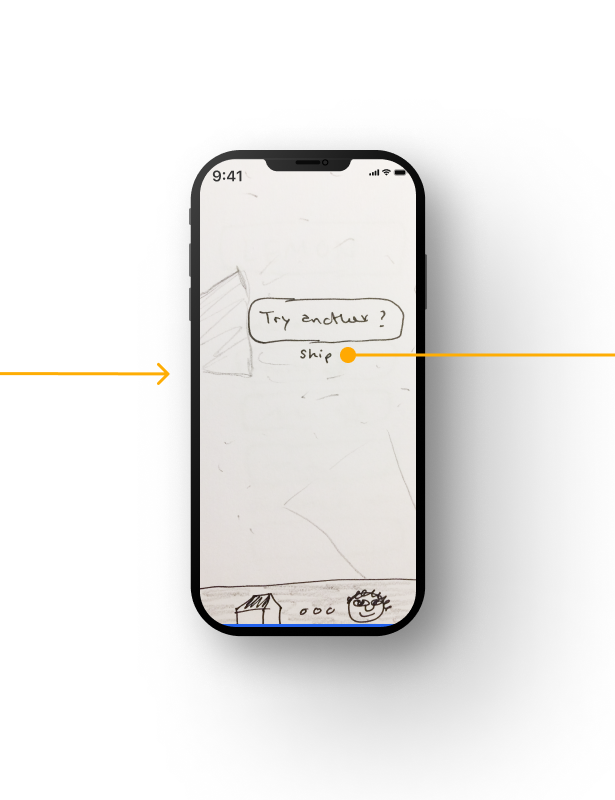
![]()
Translation saved. Play quiz?
-
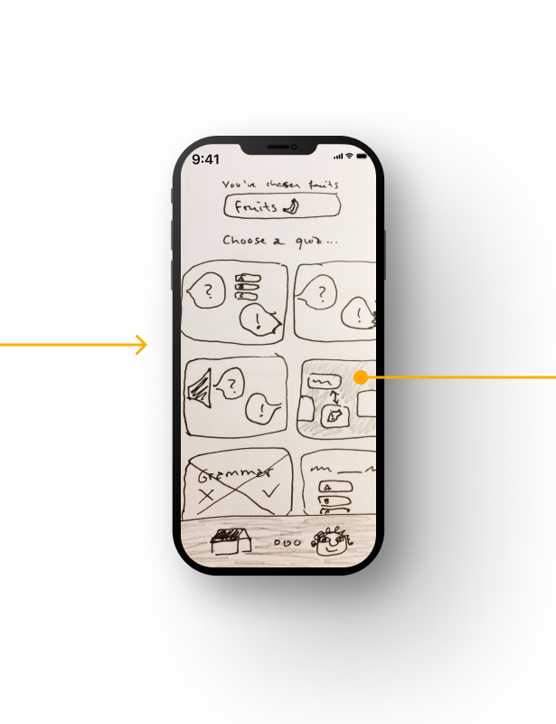
![]()
Choose quiz
-
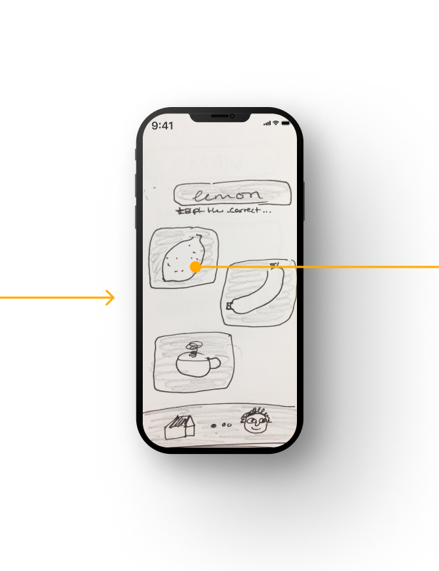
![]()
Play quiz
-
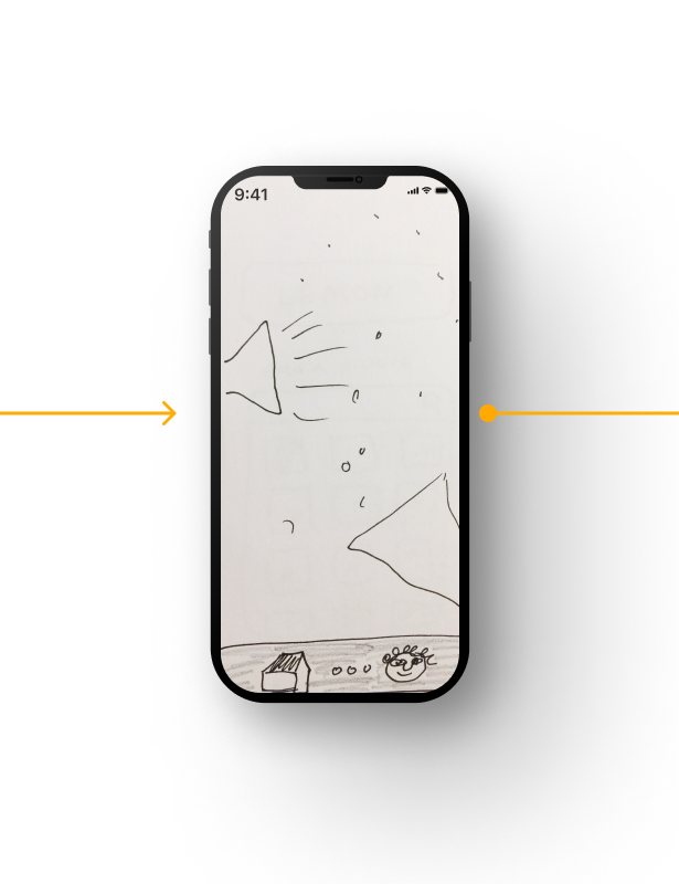
![]()
Micro-interaction correct answer
-
![]()
Play new quiz?
-
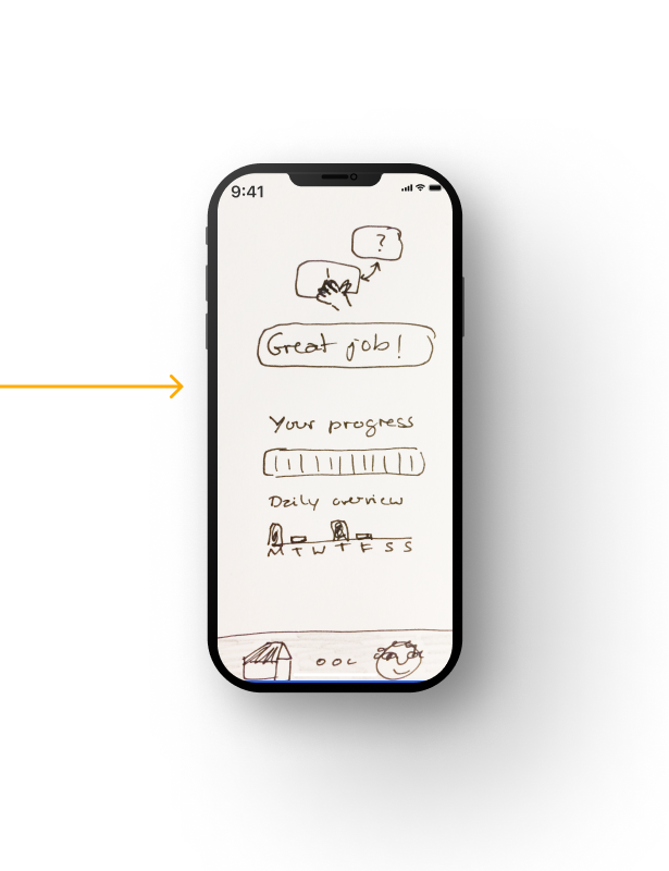
![]()
See progress
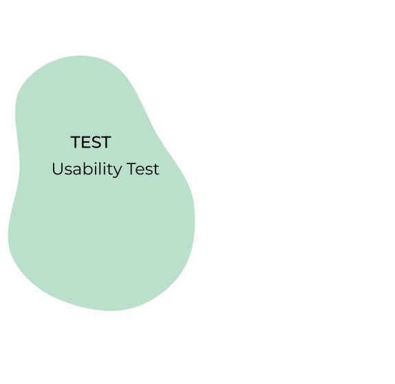
TEST | ITERATE
Usability Test
SCOPE
Testing how usable and desirable one of the main functionalities - playing a vocabulary quiz - is.
SESSIONS
There were be undertaken three sessions with a duration of 10-15 minutes.
METHODOLOGY
The study was primarily conducted as moderated remote tests, held online via Discord. The test's scope was a short introduction, a task performance with the VOCA app prototype consisting of four tasks and a final debriefing.
TASKS
Task 1: Open the app and choose the ‘match picture with word’ quiz.
You relax on the couch after a long day when you receive a space scheduled reminder to learn one of your vocabulary sets. Great, let’s see which quiz would be the most fun for this set of flashcards.
Task 2: Match the correct picture with the word.
Hmmm, which photo seems to match the word on top of the screen
Task 3: Finish the quiz.
You are done with the quiz and want to...
Task 4: Change the difficulty level.
...change the level as you feel that this test was way too easy.

Test Results & Adjustments
The test results were sorted by means of an adapted version of Jacob Nielsen’s four-step rating scale.

Visual Design
To see what a possible design identity of the app could look like, I started to create a design system. These are some of the first test mockups.
Further Iterations
My biggest challenge was the short time frame, which meant that I hadn’t enough time to include the users in the forming of the information architecture of VOCA.
Moving forward, I would like to conduct an open card sorting session to make informed decisions when designing a complete sitemap. I would also like to test the current design system before applying it to more screens.
Thanks to:
HiTu illustration component woman
IconTyl icon set
Future Now
Finding a way for women to connect & lift each other up