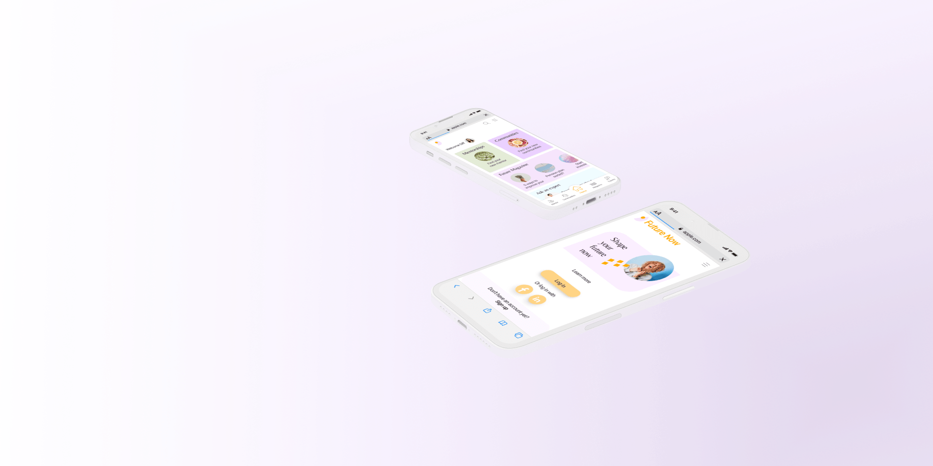
Future Now
Finding a way for women to connect & lift each other up
The project
Project brief
Future Now is a web app that offers women a place to collaborate, learn from each other and lift each other up. Find or become a mentor, find your community and learn about finances and let the finance experts support you in realizing your dreams. Shape your future now!
Project role
UX, Visual Design
Tools
Figma, Miro, Optimal Workshop, Usability Hub
Primary stakeholder
CareerFoundry UX Immersion course
Project duration
5 months
The challenge
Financial gender inequality means that women
… are more likely to take most of the parental leave, which can result in a lower pension
... are being paid less
... have poorer chances at winning an investor for their entrepreneur projects
... are less likely to invest
... are more likely to stand for the unpaid care and domestic work as well as the cognitive labour
Hypothesis
While gender inequality cannot be solved on a private plan alone, we can support each other by finding a way for women to improve their finances and to connect with other women to network and learn from each other.
The UX Design Process
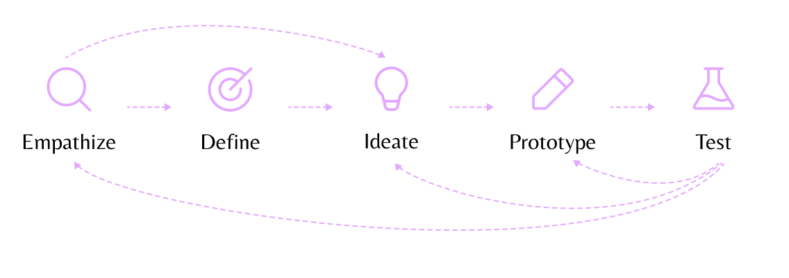
EMPATHIZE
Competitive Analysis
Which possibilities are there already?
With a possible solution at hand, I took a closer look at the Danish market to find possible competitors. Following my SWOT analysis of the two main competitors, the goal is to unite four different services in one app that excels with its user experience.
SWOT analysis insights
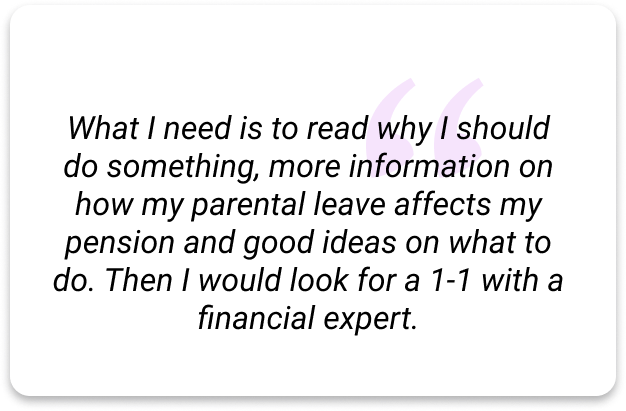
User Interviews
Who are our users?
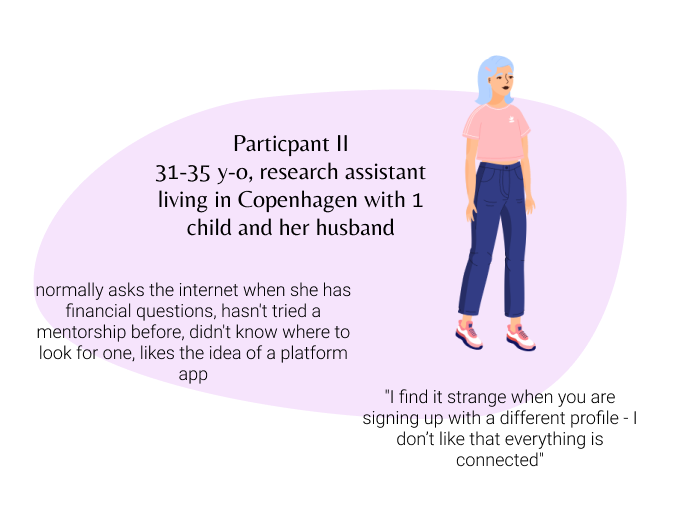
To dig deeper into possible users pains, needs and goals I conducted 7 user interviews. My interview participants were women between 29-47 years old. Afterwards, I sorted the results with the help of affinity mapping and empathy maps to identify user insights and deepen my understanding of the users.
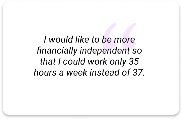
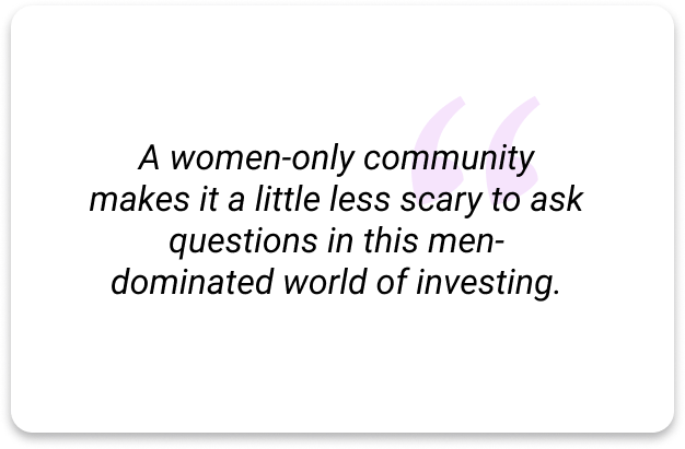
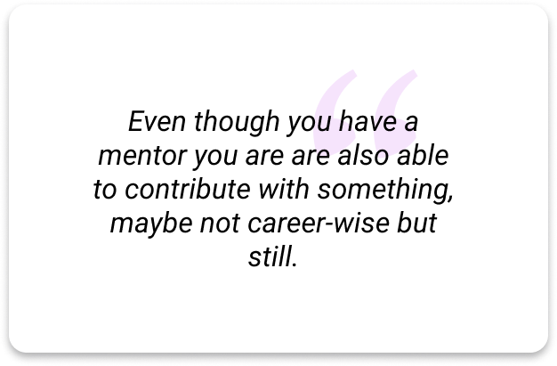
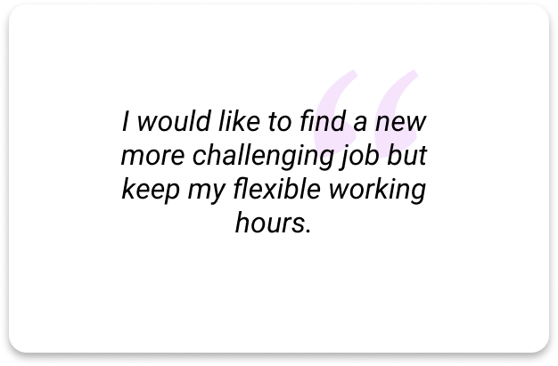
Key insights from the interviews
The following insights and the solutions emerging from these defined the new direction of the web app:
-

Opportunity
This interest for a meaningsful and well-balanced working life could be a foundation block for the web app’s identity: “shape your future - now”
-

Opportunity
To prompt users to return to the app there should be learning materials reg. finances, podcasts and articles with portraits of inspiring people or companies, discussions with the possibility to contact the expert.
-

Opportunity
This means that there should be more to the membership than the possibility to talk to experts like learning materials and other information material.
-

Opportunity
Following this, the app should include a browse a mentor function with different filters, a 'report' function if somebody is crossing the code of conduct and also guidelines for a successful mentorship system.
DEFINE
User Personas
Siff - one out of two user personas
I identified two distinct types of audiences which resulted in two user personas:
Siff, a mother in her 30ies looking for a mentor to guide her on her way to find new job challenges
Soleima, a more experienced woman who would both like to mentor others and help them but also find a mentor for the challenges she meets in her working life.
Main functions
Some details of our user persona Siff
Defining the MVP
With a better understanding of my users, their pain points and needs, I prioritized the following functional requirements:
informative onboarding
smooth sign-up process
browse mentors
find and engage with a community
read articles
contact experts
search
User Journeys
Siff’s journey through the web app
To even empathize more with my user personas, I created 3 user journeys that start with a possible real-life moment my user personas could experience and which would lead them to use the web app.
User journey
User Flow
Siff’s flow from article to financial expert
With the help of task analyses and user flows of the three key objectives, I mapped out which pages are needed and how to make the design more user-friendly by focusing on flows rather than individual pages.
User flow
IDEATE | PROTOTYPE
Wireframes
From sketches to high-fidelity
My goal was to create wireframes of three of the main functions of the app to later be able to test if these are designed usable and desirable.
From mid-fidelity to high-fidelity:
TEST | ITERATE
Usability Test
Is Future Now usable and desirable?
Finally, it was time to test the interactive Figma prototype.
See some of the details of my test plan below:
-
Test Objectives
>> Observe how unerringly users navigate when signing up and navigating the app
>> Determine if users find the mentor browsing design useful and desirable
>> Understand if the users find the search function findable, usable and useful
>> Observe how users react to the magazine and if they find the connection between the article and experts useful and desirable
>> Understand if the community design is desirable and usable -
Participants
There will be 6 participants testing the prototype. All six were recruited via personal network and chosen carefully based on their varying personal background to represent different possible user groups.
-
Goals
The goal of this study is to test the error rate and satisfaction that the app provides to new users completing the most important tasks. I would like to observe and measure if users understand the app's structure, value and core functions and find the interaction with the app enjoyable.
-
Methodology
The study will primarily be conducted as moderated remote tests, held online via Zoom. The test's scope will be a short introduction, a task performance with the Future Now mobile web app prototype and a final debriefing. The participants were also asked to answer the 'Single Ease Questions' as well as the 'Net Promoter Score' with a scale ranging from 0-10 (0=very hard/very unlikely - 10=very easy/very likely).
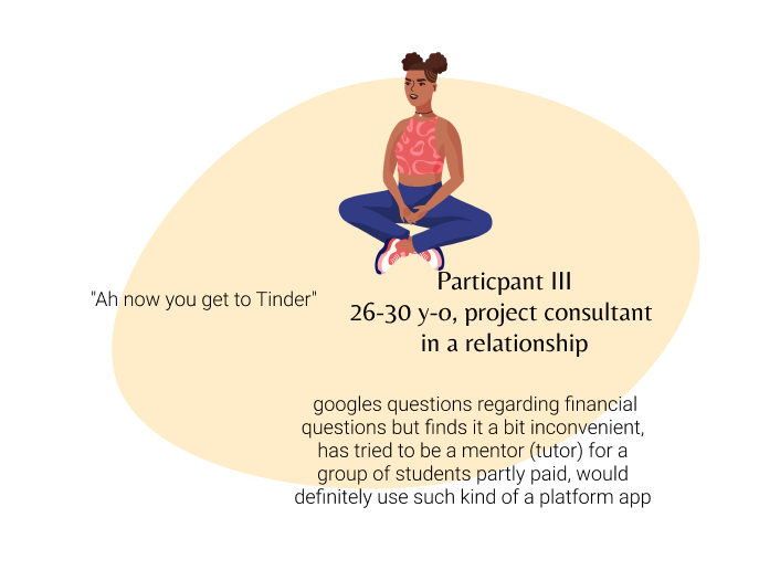
Meet three of the participants

Findings and updates
I sorted and analyzed the results with the help of affinity mapping and a rainbow sheet.
Both my observations as well as the customer’s feedback and the Single-Ease-Question results showed that the participants found the layout and the flows rather familiar and intuitive.
The rainbow sheet highlighted which features to prioritize for further iterations.
These are 3 of the main issues and iterations:
Rainbow sheet
-

Issue 1 | Major usability problem
6 of 6 users were confused by the 'Join' toggles and expected them to lead to the community.
SOLUTION: Exchange with a 'Go to' button
-

Issue 2 | Minor usability problem
3 of 6 participants expressed their dissatisfaction with not being able to sign up with their email instead of using their social media accounts.
SOLUTION: Add another signup possibility
-

Issue 3 | Minor usability problem
6 of 6 users tried to click the profile first before clicking the ‘Contact Charlotte’ button.
SOLUTION: Move the button closer to the profile
Visual Design
Capturing the spirit of
Future Now
The design is based on the initial research interviews and feedback by the test participants but also on Visual Design Principles that enhance the visual appearance of the prototype as well as Emotional Design Strategies to help boost user engagement.
-

Visual Design Principles
The grayscale made it hard to see the difference between the four categories which resulted in a jarring and distracting welcome screen.
Following the Principle of Unity, the new design highlights the difference between the categories by their different colours. -

Emotional Design
The design of the app should transmit its fresh, young, lively and energetic identity. The app is all about empowerment and the colours should transmit this feeling.
Furthermore, the colours should have a warm touch to them, as it is meant to be a safe space for sharing personal issues as well.
Retrospective
More research, testing & iterating
Future Now at its current state would offer women a safe place to support and lift each other up. The user input gave me useful insights into how my initial app concept could be improved and the results of the Net-Promoter Score seem to confirm this.
The unmoderated closed card sorting session seemed to be a bit challenging for some of the participants. Next time, I would conduct the session in person or be available online while they are testing, so that I am able to support the participants better.
Future plans are that non-binary people should feel welcome as users as well as they face similar challenges and also could profit from a safe space to share and learn from each other.
Finally, by creating an attractive environment for mentors and financial experts to support other women and non-binaries, the web app will become a helpful tool to fight financial gender inequality.
Thanks to:
Flaticon: Those Icons (telephone, envelope, hearts, search), Pixel Perfect (close, communities, correction, equalizer, home, experts, stars, burger menu), Freepik (warning, LinkedIn, Facebook), Darius Dan (mentors, newspaper)
IconTyl icon set (clock, share, thumb)
Unsplash
Artboard Studio Mockups
Mockup Figma Plugin
VOCA
Designing a vocabulary app that is fun and makes new terms stick